
After the successful release of the bottle and label design for Sokol Blosser “4”, the winery’s limited-edition Pinot Noir, Allied Works was commissioned to renew and re-imagine the packaging and identity for their full line. Taking cues from our earlier collaborations, and years of experience working with the family, we developed a system that focuses on the tangible and elemental aspects of wine labels, and also celebrates what makes Sokol Blosser wines so unique, and so uniquely attuned to place.
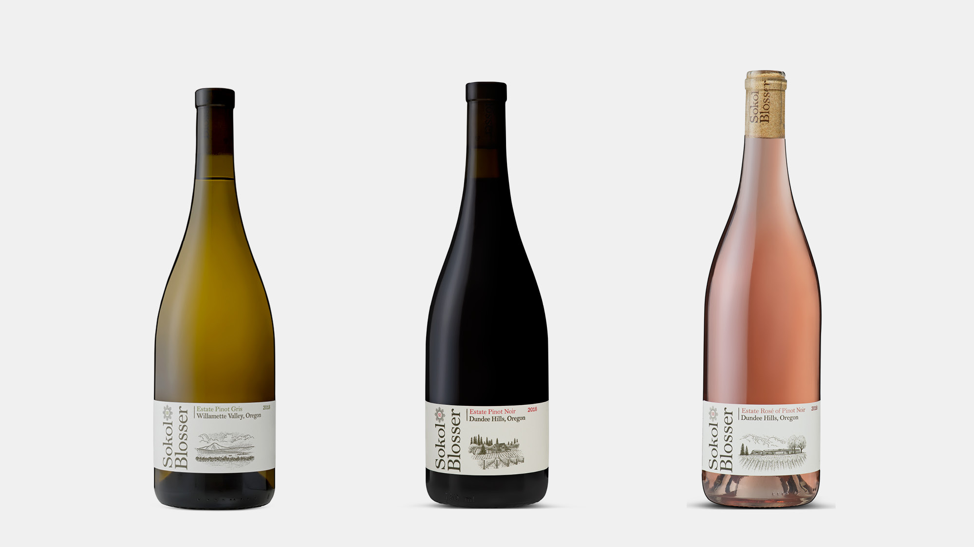
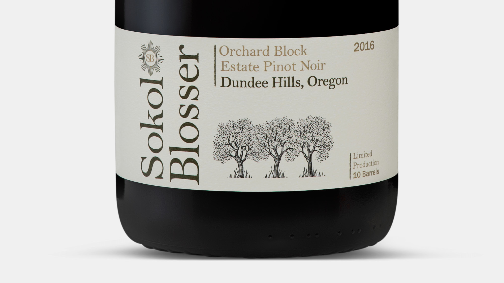
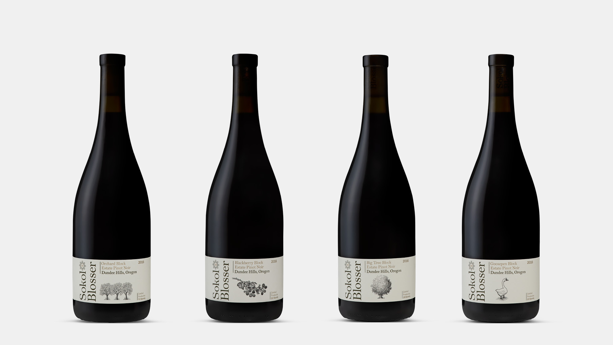
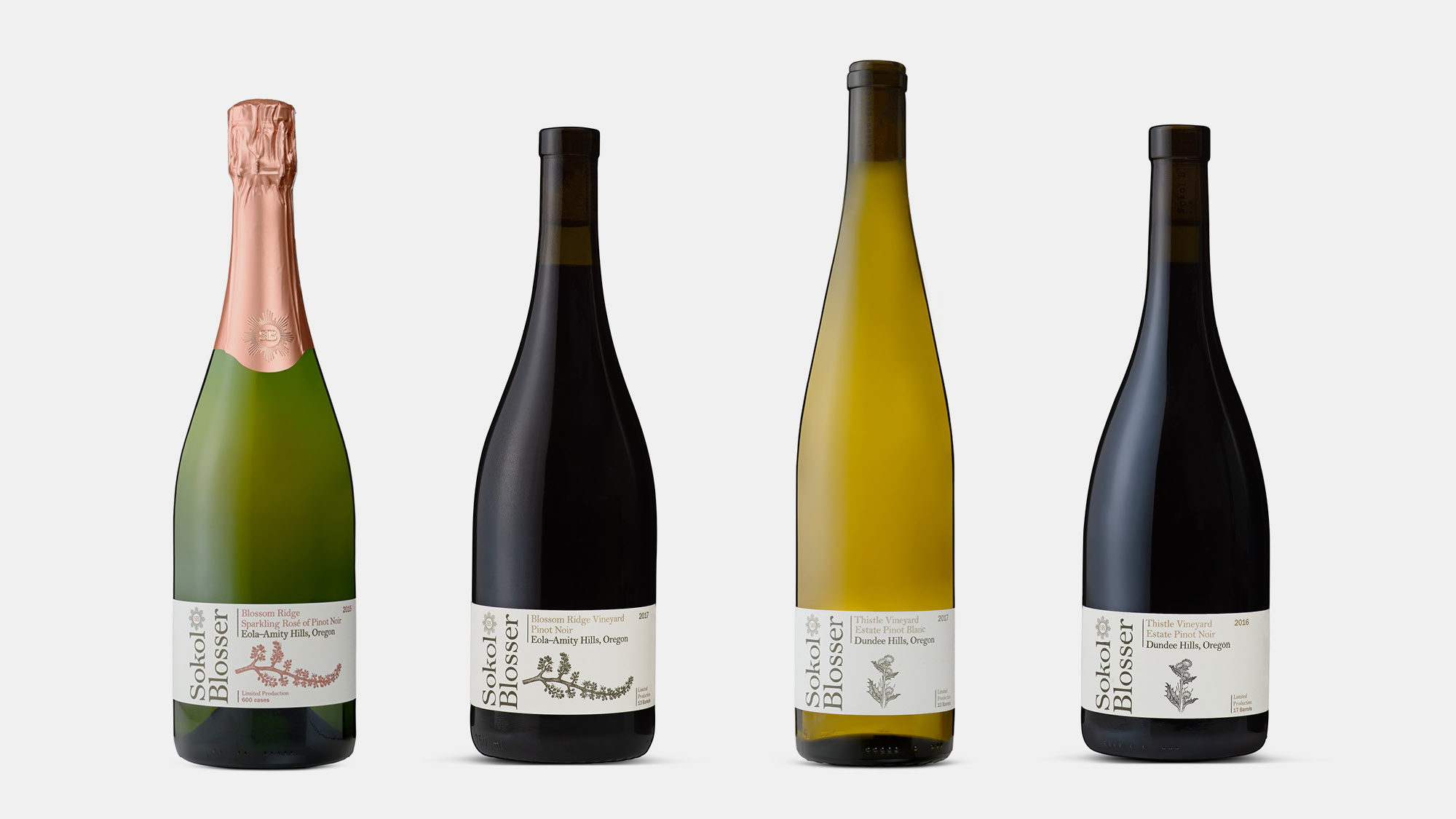
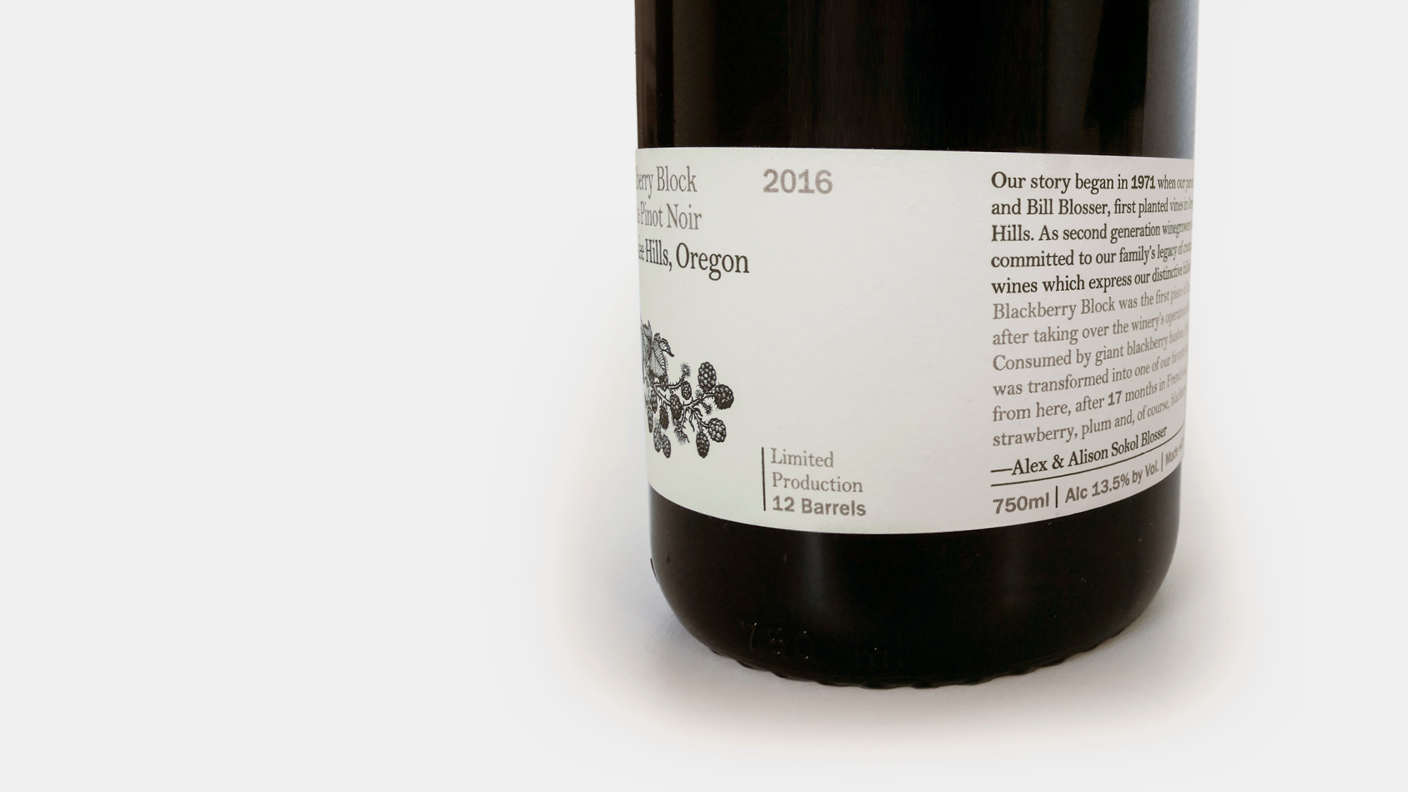
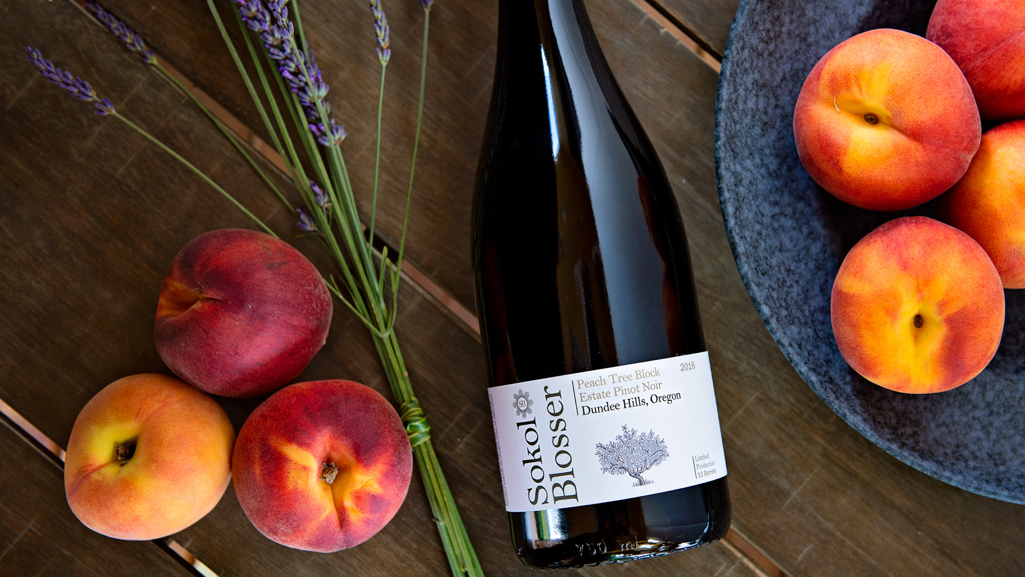
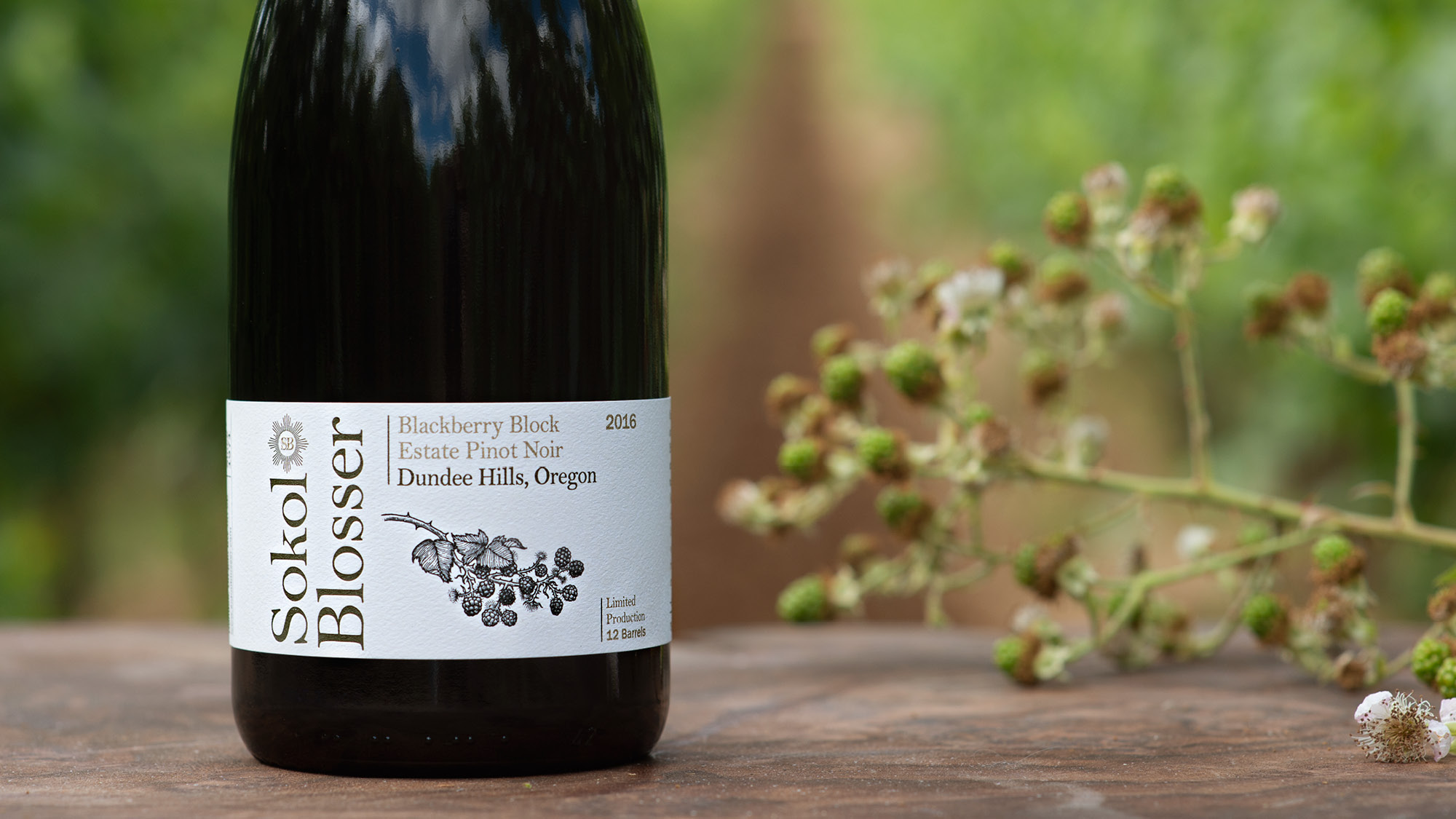
Stewardship and celebration of the land is central to Sokol Blosser’s philosophy. The design helps clarify where each wine is produced through commissioned illustrations for each area their fruit is grown: the Willamette Valley and Dundee Hills AVA, specific vineyards, and individual blocks on their estate. To celebrate the history of the Sokol Blosser family, we streamlined and simplified their iconic sunburst logo, and employed a refined typeface that recalls the first labels the family produced as one of the pioneers of the Oregon wine industry.
Sokol Blosser is fully committed to sustainability and wise use of resources. The labels are printed on high-quality recycled paper and overall, we eliminated unnecessary packaging to reduce the amount of materials and energy needed. In a broader sense, the labels are an invitation to look closely at the land, and appreciate the details that gives each vintage its distinctive character.